The right colour can make a living room feel calm, a bedroom feel restful and a patio feel like a natural extension of the house. The wrong one can clash with everything around it or make a space feel smaller and darker than it is.
Choosing can feel a little overwhelming when you are looking at a wall of swatches, so here is how we help customers narrow it down, for both indoor blinds and outdoor blinds.
Start with your existing colour palette
Before you look at a single swatch, take stock of the colours already in the space.
- Walls and floors: what are the main colours of the walls, the flooring or paving, and the window frames?
- Large furniture: what colour is the sofa, the bed, the dining table or the outdoor setting?
- Accents: what colours show up in cushions, rugs, artwork, planters or decorative pieces?
For outdoor blinds, also look at the roof, gutters, patio posts and fence. Blinds sit right alongside all of them, so they need to work with the outside of the house as well as the view from inside.
From there you have two main approaches.
- Complement: choose a colour that works with your palette without matching it exactly. If a room is mostly warm neutrals, an earthy tone or soft green adds depth without fighting the scheme.
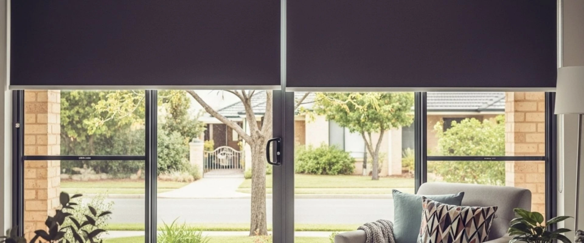
- Contrast, with care: a contrasting colour makes a bold statement. A darker blind against lighter walls frames the window dramatically. Just make sure the contrast is deliberate and suits the room, rather than looking like a clash.
Neutrals are the safe choice
White, cream, beige, grey and charcoal are popular for good reason. Neutral blinds sit happily with colourful walls or bright furniture, and if you repaint or change your decor later, you will not need to replace your blinds to match.
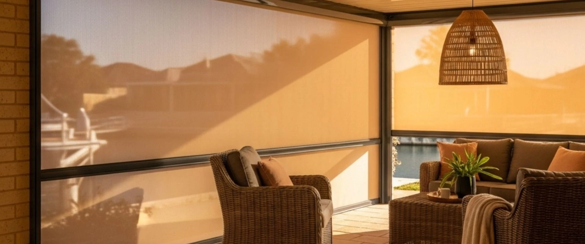
Outdoors, neutrals suit almost any theme you create on the patio, from coastal to Mediterranean. They also tend to blend in with the house rather than drawing the eye, which is often what you want when the blinds are rolled up most of the day.
Light versus dark
Light and dark colours change how big a space feels.
- Light colours reflect more light and make a room or small patio feel larger and airier. Paired with darker walls, light blinds open up the space.
- Dark colours create a more intimate, cosy feel and frame the view. A dark blind against lighter walls looks sharp and modern.
Think about function too. Outdoors, many people find that darker mesh fabrics are easier to see through and cut glare well, while lighter fabrics let more light through and keep a patio brighter. Indoors, darker blockout fabrics suit bedrooms and media rooms, while lighter translucent or sunscreen fabrics soften the light in living areas.
Warm or cool colours
Colour affects mood as well as looks.
- Warm colours such as reds, oranges, terracotta and yellows create energy and a welcoming feel. They can make a courtyard feel cosier through the cooler months.
- Cool colours such as blues and greens feel calm and refreshing, which suits rooms and outdoor areas that cop the summer heat.
Strong colours work best in measured doses. A bold blind can be the feature of a room, but if the walls and furniture are also bold it can quickly become too much.
Matching your trims and the rest of the house
White and off-white trims match almost anything and help a space look larger. For outdoor blinds, the frame, headbox and side channels are usually powder coated aluminium, so you can choose a frame colour that matches your gutters, window frames or patio posts and a fabric colour that suits the space.
Once you have chosen your blinds, bring the look together with cushions, throw rugs, outdoor furniture or a few large colourful pots. These are easy to change later, while the blinds stay as a neutral or complementary backdrop.
Look at real samples in your own light
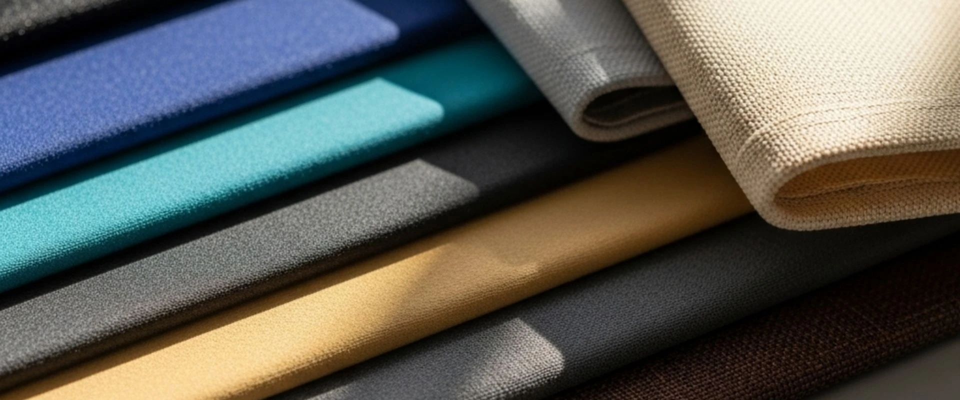
Colour on a screen or in a brochure never looks quite the same as it does at your place. Morning light, afternoon sun and artificial light all shift how a fabric reads. Ask to compare fabric samples alongside your walls, floors and furniture, and discuss how the colour looks in different lighting.
You can browse the styles on our indoor blinds and patio blinds pages, and see the range of outdoor fabric options on our fabrics page. Every Betta Shade blind is custom made to measure, so you are not limited to whatever happens to be on the shelf.
Our colour checklist
- Note the main colours of walls, floors, furniture and, outdoors, the roof and trims
- Decide whether you want to complement or contrast
- Lean towards neutrals if you like to change your decor
- Use light colours to open up a space and dark colours to frame it
- Think about how much light, glare control and view you need
- Check samples at home, in your own light
Need help picking the right colour? Book a free measure and quote to discuss colours and fabric samples, or call (08) 9582 0083.